
A Calming New Identity for Silvergum Supports
📸 Silvergum Supports is a luxury farm stay offering NDIS participants a home away from home
Belmond is proud to have partnered with Silvergum Supports on the launch of their new branding, created to reflect their mission of offering tranquil, supportive stays for NDIS participants.
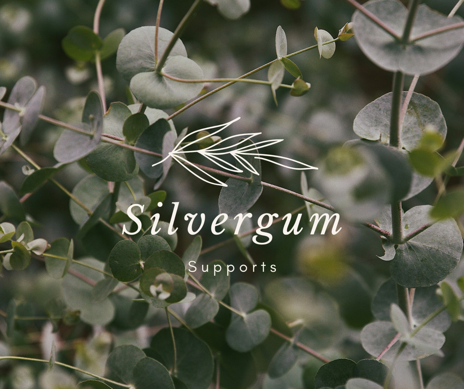
From the beginning, the goal was to design a visual identity that felt calm, reassuring, and grounded in nature — a true reflection of the experience Silvergum Supports provides. The name itself inspired much of the creative direction: silvergum suggesting strength and growth, while also tying to the Australian landscape.
The colour palette of soft green and cream was chosen to evoke serenity and balance. These tones create an environment of trust and calm — both important for participants and their families. Typography was kept clean and approachable, ensuring communication always feels clear, warm, and welcoming.
The logo design itself balances modern simplicity with natural inspiration, drawing on the organic shapes of gum leaves to create a mark that feels both professional and personal. It’s a brand that is instantly recognisable, but also adaptable across signage, digital platforms, and printed materials.
Silvergum Supports’ launch is more than a new service — it’s a commitment to dignity, care, and peace of mind for those who need it most. Belmond is honoured to have played a role in shaping a brand identity that will grow with them on this important journey.